Hammer & Sickle with Big Mac


Andy Warhol, Hammer and Sickle with Big Mac, 1976

At the Warhol exhibit at The Whitney, in a glass case at the end of a wall, towards the end of the exhibit and surrounded large and both well-known and less known pieces, is a group of small, gray, low contrast photographs. These were produced to be made into larger silk screen ‘paintings’. Of these, one photograph landed as possibly my favorite piece in the show; a photograph of hammer and sickle with a Big Mac. (There was also a related one of a hammer and sickle with a loaf of wonder bread). The paintings made from these photographs have been written about and are more familiar, however somehow these small photographs feel like they have more impact and are funnier.

As somebody who gives primary value to the visual experience it’s surprising to me that I should respond to something so dull in appearance. At the time that this work was made the US and USSR were still locked in the embrace of The Cold War. That this image is so blunt and undramatic stands in stark contrast to the high stakes of potential nuclear annihilation.

What struck me though is that this image can be seen as prophetic. I’m not claiming clairvoyance on the part of Warhol; however, from where we stand the inclusion of these actors on this still-life stage, in this way, makes me consider how these two countries have become more alike than could have been expected, and not in a good way. Hegelianly speaking the opposing theses of Democratic Capitalism and Communist Totalitarianism have synthesized into a paradigm of Totalitarian Capitalism. Certainly that seems to be the direction we’re moving as Russia and The US take on the worst qualities of the other. This, though not the image, makes me think of one of the opening passages from Macbeth, describing an ongoing battle in terms of two spent swimmers grappling together and so both drowning.

This reflection brings the piece in line with the morbid aspect of Warhol, which runs underneath the dominant layers of humor, irony, distance and shallowness. For all that snarky humor and distance, and all that I may be projecting too much into this piece, I can’t shake this odd little image and with it, grief for the present and future that we have collectively created.

Shabbyism


My first great art teacher was a tall black man named Bernard Harmon who ran the art program at Central H.S. in Philadelphia, an all boys public magnet school. 40 years later I still remember him saying, “Artists love to talk. Musicians practice, actors rehearse, writers write and artists talk.” I think I’ve taken a studio work ethic with me all these years since then, and yet today I’m thinking about the benefits of talk. For one thing, it was talking that got me excited about beginning this ongoing writing project, when, last week I had lunch with Alexi Worth after returning a painting to him. We talked about shows we had seen and our individual take on artists such as Terry Winters and Kerry James Marshall and also about writing and in particular about writing negative reviews. I have so far avoided writing negative reviews preferring to put my energy into art I can really get behind. It occurs to me thought that this format may be more conducive to taking a look at art problems.

alexiworth-puzzlepiece-2016-mixed-media-on-mesh22x33

Alexi Worth, PuzzlePiece 2016, mixed media on mesh, 22×33″

While we were talking I brought up about a review I began of the Whitney Biennial in 2012, that I never completed. My thesis was that the curators and many of the artists were motivated by art world embarrassment. That we don’t want to admit in these times of anti-1%er that the art world lives largely in service to and support by the 1% and so in the long tradition of insulting the bourgeoisie, almost all the work exhibited was shabby and scruffy, doing its best to look anything other than rich. Alexi immediately coined the phrase Shabbyism to describe this phenomena. What a great thing! This was the result of fluid and ranging conversation about art, an in the moment co-creation. Being an introvert and a painter means spending huge amounts of time alone with my own thoughts and ideas, but at some point they just keep turning on themselves. Much like the studio visit from Michael Berryhill a few days ago I was able, through conversation, to see more clearly what I’m doing, seeing and saying.

Strange Reporting


After more than 2 years of neglect I’m re-opening my Painting Lives! blog. My idea is to approach this in more of a diary form than full on exhibition reviews. It will be less formal and I intend to get less wound up about language and writing quality, instead focusing on a range of art and painting-related topics. These will include thoughts about conversations and studio visits, about art that I see and have seen and things I’m thinking about in the studio, without having to necessarily flesh out thoughts completely. My intent is to write 3 to 5 days a week. I’m hoping it will also make what has often been a bit of a grueling task, more fluid, more fun and help me stay sharp; in short, it will provide practice. I will continue to write reviews and post them on the Huffington Post and perhaps shortly other sites.

20161205_182133.jpg

Studio wall with paintings in various states of completion.

It occurs to me that this is very much how I approach painting. To the best of my ability I take the breaks off and let myself be open to the vagaries of mood, feeling, letting what will happen on any given day. This has allowed me to become more productive than I’ve ever been, and to stay in connection to what it is I’m actually doing, until those days when magic takes place, parts come together and I feel myself more as a vehicle for the divine than the petty ego demands that can be so tiresome; (every painter I know has these kinds of ego thoughts. It’s called professionalism, and though it has its place it’s not what really MATTERS. I’m sure I’ll return to this topic later.)

Today I received a studio visit from one of my favorite painters, Michael Berryhill. Some studio visits bring confusion or re-visioning, while others bring clarity and a sharper awareness of what it is I’m actually about. This was one of the latter variety and I’m feeling extremely energized by it. Michael is one of the painters that I feel the most close to in terms of painterly concerns and practice and yet, being different people his particular way of looking at things was very refreshing. He spoke about his and my paintings as ‘Strange Reporting.’ I love this idea. It relates to how I described my work a few years ago as being paintings of things that you don’t quite know what they are. It’s an acknowledgement that the paintings are taken from, inspired by and about the world, about experience, things seen and felt. That the paintings should be somehow oblique, mysterious and indirect is also a reflection of that reality. I want to avoid anything that sounds like justification here because it’s unnecessary. The thing is, I often feel I’m chasing something, a memory, a feeling, a dream, an obsession, that resists explication. This may be the essence of why I, and I suspect many others, paint. ‘Strange Reporting’ strikes me as a beautiful and apt phrase for this experience. Thank you Michael!

Opening Reception: William Eckhardt Kohler & Judith Mullen, Friday May 23, 6-9pm


William Eckhardt Kohler, “Portals, Passages and Vessels”
Judith Mullen, “A Good Wander”
May 23, 2014 – July 5, 2014
Opening Reception: Friday, May 23, 2014, 6-9pm

327 N Aberdeen, Suite 151  Chicago, IL 60607  www.lindawarrenprojects.com

Linda Warren Projects is pleased to usher in the spring season with solo exhibitions by gallery artists William Eckhardt Kohler in Gallery Y and Judith Mullen in Gallery X. Kohler, a painter, and Mullen, a mixed media artist, share an affinity for drawing upon their experiences of the world around them, as they are both avid travelers and keen observers. For Kohler, a move to New York has injected structure into his intuitive painting practice, while Mullen’s traversing between urban and rural environments prompts an investigation of the way in which humans interact with the natural world.

In “Portals, Passages and Vessels,” William Eckhardt Kohler presents a new body of work that constitutes an aesthetic breakthrough in his picture-making. Those familiar with Kohler’s long painting career will immediately note that the fragmented images, taped-off lines and geometric forms are in sharp contrast to the fluid, harmonious nature paintings of his past oeuvre. According to Kohler, the artist’s almost-full-time relocation to New York City has opened his eyes to the spirit within the manmade that he never before recognized. 

Where the urban environment motivates Kohler, the natural world is at the forefront for Chicago-based artist Judith Mullen. The artist’s regular treks through the forested areas outside of the city provide for her an endless trove of inspiration. In “A Good Wander,” Mullen has taken hold of the tree and all of its symbolic associations. The tree and its byproducts: bark, wood, branches, sawdust, paper, cardboard and glue are combined with materials like Styrofoam, paint, and resin, their commingling highlighting both the similarities and the differences between the natural and the manmade.

images: (top) William Eckhardt Kohler, Hiker at Night, 2014, oil on canvas, 44” x 37”; (bottom) Judith Mullen, Afoot VII, 2014, plaster, fabric, resin, sawdust, paper, wood, enamel, Styrofoam and wire, 82” x 52” x 8”

HOURS: Tues-Sat, 11-5 PM and by private appointment
CONTACT: chris@lindawarrenprojects.com     312.432.9500


A few current shows Part II


As well as the numerous group show that I wrote about several days ago, several one-person shows from the Lower East Side caught my attention; Steven Harvey Fine Art Projects featured the work of a young painter, Eleanor Ray, who makes exquisite small paintings of small moments, mostly interiors and cityscapes. Their is a sensitivity of touch and delicate light that brings to mind Corot’s small plein-air paintings. But, Ray, does not belong to the school of trying to revive the lost glory of painting. Rather her work appears to spring from the simple pleasure of seeing and painting the rhythms and patterns that she finds in the world around her, for instance the way a grating or window frame divides the space beyond it into an abstraction of geometric and occasional organic shapes. It would not surprise me to find that she has Mondrian on her mind as much as the paragons of representational painting.

eleanor_ray_evite

At the bottom end of the Lower East Side, the paintings of Daniel Rios Rodriguez are on view at Sargent’s Daughters, 179 East Broadway. These paintings are also mostly small , though slightly less so than Ray’s. The tone is a kind of comic grief. The subject; skulls, lemons, weedy grass, an old tennis shoe, speak to small moments of pain, loss and inevitable entropy, but with a sense of humor. Rodriguez scratch- draws into the painting creating a graphic quality like the drawing in comic books. He also places collages pieces of linen and tee-shirt into the paintings, which on one hand opens the painting space back up, but can also seem a little self-conscious about not being straight forward painting. Among my favorites is the warm autumnal feeling Dig A Pony after one of the last Beatles songs, from Let It Be. Weeds and insects are scratch-drawn into an almost entirely white impasto relieved by a brief rainbow colored lump bottom center and a bright but small black sun. The feeling of longing and loss, like last return of summery weather and impending winter, is palpable.

DigaPony2014oilflashelinencanvas9x11

Daniel Rios Rodriguez, Dig A Pony, Oil, flashe, linen and canvas on linen, 2014, 9 x 11″

Around the corner at 29C Ludlow Stat Blackston Gallery, are paintings and drawings by the abstract painter Patrick Keesey. The drawings in particular reflect a process that while initiated by observation of nature are more about the feel of the act seeing rather than a description of what is seen. The paintings are a built up from squiggly marks accumulating into spatial clusters, apparently more process driven than the drawings. Though the paintings recall the built up loops of Jim Lutes’ paintings, a calligraphic version of Guston’s early 50s abstractions and the poetic blurts of Twombly, they remain Keesey’s by dint of their experiential basis.WileysFugue2014Oil-linen26x22

Patrick Keesey, Wiley’s Fugue, 2014, oil on linen, 26 x 22″

Just opened at Pablo’s Birthday on Orchard is Pius Fox- We Expected Something Better Than Before. Fox is a young German painter whose work usually lands on the abstract side of identifiable reference, though it is clear, that like Keesey, he is taking his visual cues from the world around him, in this instance the studio; windows, books and leaning paintings among the more frequent starting points. The paintings are mostly quite small and conflate sharp edges and a painterly hand. They are sensitive and meditative in feeling, a bit of a cross between Richard Diebenkorn and Agnes Martin. Perhaps the paintings mostly stay too much within a narrow range in emotional tone; but, Fox is certainly a painter to watch.

Untitled (PF 1403-37)-Oil on canvas-30x22cm-2014_8581c9

Pius Fox, Untitled, 2014, oil on canvas, 30 x 22 cm.

Cora Cohen- Divine Madness


I’m continuing my project of reposting pieces from my Huff Post archive. This article was originally posted on March 1, 2013.


Cora Cohen’s paintings, now on view at Guided By Invoices, invite the viewer to pause, to slow down and to step out of the demands of our time-bound reality. She does this with work that is the visual equivalent of a large-scale whisper or in musical terms, they are analogous to ambient music in its starker and darker forms.

The resonant quiet of her work allows the viewer to contemplate and appreciate the various moves and counter moves that the artist chooses. First, she usually chooses to stretch her paintings on shallow frames that reduce their presence as an object on the wall. Second, in many of the paintings she builds a dense, and very physical textured ground reasserting their material presence. Third, over this she may brush washes of pigment and graphite dispersed in water, so thin and diffuse that they barely register any physical paint depth, if at all. Out of this non-presence an illusory and allusive pictorial depth emerges. That is not to say that the artist is purposefully painting an image, because she is most emphatically not; yet, with the barest means a world not quite of this world is suggested.

2013-02-27-Drawing4Grey.jpg

In “Drawing4 Grey”, the painting can be read as veils, diaphanous curtains or as the echo of a forest. Towards the bottom left of the canvas, Cohen has left a very small square of the white ground showing, which reads clearly as a door or an opening out of the forest. Though this was an accidental remainder, a result of painterly process, and not an intended illusion, she did leave it. The entire nature of the piece invites a meditation on the eternal and what lies beyond this plane of existence. The veil-like quality invites thoughts, at least for this viewer, in a metaphysical vein.

2013-02-27-RedTablet.jpg

In another twist it is difficult to look at this work and not think about The New York School. But this is a bit of sleight of mind, as the work is absent of the heroic gesture typical of at least many of the practitioners in this tradition. This is not the grand opera typical of abstract expressionism. Cohen has a way of undermining the directness of her own mark, burying it, blurring it and hiding it. The paintings are diffuse, elusive and allusive, raising more questions than they answer. It is easy to imagine many hours spent in the studio looking, thinking and waiting; restraint as a working principle rather than haste or aggression.

2013-02-27-Curtain7.jpg

The works in this show fall into three color groupings. One is a poisonous or muted acidic range of green, yellow and orange. Others could be categorized as rust or red earth. Still others are almost entirely in black and grey tones. The range of color that Cohen coaxes from these limited palettes is profound, and a testament to her mastery, in particular the paintings that are based primarily on a range of black, white and gray; they never read as monochrome. Taking color that looks as if it could be soot from a New York window she expands it into a sublime otherness.
Cohen speaks of the desire to counter that aspect of our world which is fragmented into endless tasks, distracted, time-bound and overloaded. Sitting and looking at her work and in conversations with her, I am reminded of the alchemists as seen in Dutch genre paintings; passing days with their pots of materials, transforming stuff with little value into something transcendent and rich. This is divine madness and ultimately what draws me to and keeps me looking at these paintings.

Cora Cohen- The Responsibility of Forms – recent paintings was on view at Guided By Invoices, 558 W 21st St. NY, NY through March 16th, 2013. All images courtesy of Cora Cohen and Guided By Invoices. Photography by Stan Narten.

A few current shows Part I- downtown, group, mostly


People often ask me, ‘what have you seen around?’ and I dig around in my memory for a semi-comprehensive list of from my rounds. So, here is a potential walk of primarily group shows (and one two-person show) mostly on the Lower East Side. Part II will be some one-person shows, and something from Chelsea.

Image

Benjamin King, Untitled, acrylic on paper, 2011

At Longhouse Projects at 285 Spring St in Hudson Sq. (West of SoHo) there is a fine show of work by Benjamin King and Abdolreza Aminlari. I will be posting a longer piece on King’s thoughtful and emotional paintings soon.While these paintings are built on landscape structures, closer looking asserts King’s commitment to the language of Romantic abstraction.

Heading over to the Lower East Side there are all kinds of treasures tucked about. At Brian Morris Gallery, 163 Chrystie St., is ‘How the Light Gets In’, comprising three young painters, Alicia Gibson, Kristina Lee, Jaqueline Cedar, who show a lot of promise. All three seem unintimidated by the traditional painting framework, working with a fresh, unburdened and open approach. Below is one of Kristina Lee’s smallish acrylic paintings.

Kristina Lee-selfp(KL)how thelightgetsin

Further down Chrystie, at Horton Gallery, is a fantastic painting by Dennis Congdon behind the desk. Regrettably I missed his show there last month, however here is a painter who at 60+ should be getting his due. These humorous and masterfully executed paintings in flashe and enamel, evoke both a future post-apocalyptic and archaeological feel in a way that integrates classical, modern and comic book sensibilities. The drawn elements are achieved through creating an elaborate cut stencil.

DennisCongdon.Afrodite(dishabille)2013Horton

Dennis Congdon, Afrodite (dishabille), 2013, Flashe and enamel, 94×107″

At Novella Gallery, a basement space at 164 Orchard Street, a group show called ‘Soul’ includes pieces by artists I’ve written about before, Peter Williams and Kyle Staver, shown below, as well as Fred Valentine, Kenny Rivero, Elleen Lin and Ana Weider-Blank. I would go so far as to say that soul is back as an artistic value, or maybe that’s just what I look for and dig out in my rounds.

Install07-1024x850

Install05-1024x868

Installation shots for “Soul’ at Novella, including pieces by (top) Peter Williams, Kyle Staver and Kenny Rivero, and (bottom) Fred Valentine, Eleen Lin and Peter Williams again.

FarewellNYCfornow2013wcinkwaxgraphite22x16

Olive Ahyens, Farewell NYC for now, 2013, watercolor, ink, wax and graphite, 22×16″

Down Orchard St, at Lesley Heller Workspace, Olive Ahyens curated a show titled ‘Enticing Luminosity’. Ahyens’ cityscape drawings present the Apollonian triumph of Manhattan tower-dom (ablove) as something, wobbly, uncertain and temporary. From the always lively Judith Linhares, three flower paintings bring solidity and bounce to the moment in the floral life just as they begin to wilt. In a way they share the quality of imminent collapse of Ahyens’ drawings. Rather than a mood of doom though there is a sense of the moment of beauty seized and fully engaged; particularity in Linhares’ vigorous and sensuous paint handling.

JudithLinharesApril201022x26

Judith Linhares, April, 2010, oil on linen, 22×26″, courtesy Edward Thorp Gallery

I had not previously seen the tragi-comic works of M Louise Stanley. ‘Rich Lady Languishing ‘ hits the archetypal chord of fantasy opulence. Like the previous two works there is a clear feeling that this moment cannot possibly last, and may in fact be a retrospective gaze into a world simultaneously rotted and desirable.

MLouiseStanley.Rich Lady Languishing2014acrylic40x30

M Louise Stanley, Rich Lady Languishing, 2014, acrylic on canvas, 40×30″

Still on Orchard St., at DCKT Gallery, another group show, ‘Shorthand’, curated by Trudy Benson and Russel Tyler, which focuses on works that ‘impart eloquent, direct brevity’. The paintings of Andrea Belag are done with hard-won simplicity of means, using very large brushes and  wet-in wet viscous paint, producing moments of pleasure and surprise. With ‘In Time’ red paint from the lower portion of the canvas carries into the blue upper portion suggesting a sunset glow such as those favored by the 19th century Luminist painters.

DCKTAndreaBelagInTime14linen70x60

Andrea Belag, In Time, 2014, oil on linen, 70×60″

Petey Brown- Dancing With Paint


The following is the catalog essay that I wrote for Petey Brown’s upcoming show at A.I.R. Gallery.

Large_4Frenchvanilla36x30 As a creative act, painting shares characteristics with many other art forms; music, theater, poetry, dance, which can serve as rich analogies for what it is like to paint. Petey Brown has a long history of utilizing dance as an apt metaphor for the physical graces and challenges of making paintings. She has found in The Tango, the subject of her most recent body of work, a perfect vehicle to address the dynamics of forming images in paint. The Tango is a dance form thematically driven by the nature of aggression, submission and domination, but also centered in the heart and the passion of connection.

The nature of the medium of painterly paint is that it initially flows; only to become sticky and resistant when too much of the artist’s critical will has been imposed on the painting through revisions, reworks and redo’s. To engage in this difficult dance with paint is almost impossible to maintain without it being an act of love. This is the ground that Brown has staked out for herself as the subject underneath the subject. Brown has said “Communication, passion, abandon fuel the pictures, which are a pathway to the sensuality of the paint and the pleasure of color.”

The serial repetition of imagery provides Brown, as it has for many painters before her, the means to grapple, to have another go, to take the turn passed by the previous time. There are moments when the painter stops at the divine intersection of bliss and pleasure, when image and paint coalesce into a seamless union. There is a sense of humor and play in the paintings, too. Perhaps the dancers in her paintings, as characters, are a little clumsy, a little imperfect, representing the humanity and vulnerability of doing something simply because it is enjoyable.

Brown’s figures usually exist in a flat non-space, reminding us of the primacy of the physical moment of painting rather than the depiction of a reality. The paintings can be awkward but also comfortable in their discomfort as if signaling to the viewer, ‘yes, this is me, as I am.’ In this way, Brown’s paintings recall the gnarled unfurlings of early Jackson Pollock, while he was under the influence of Thomas Hart Benton.

Olay-Large_2

In ‘Ole`’, a series of energy waves on the ground plane separate and connect two opposing lines of oddly faceless dancers. Several of the shoes are realized as the most substantive forms in the painting, grounding the otherwise otherworldly figures. The abstract and disembodied quality of these figures, some little more than ribbons of color, invokes a state of religious ecstasy like the figures from El Greco or William Blake. Evidence of scraping, repainting and layered pentimenti make it clear that this was a hard won painting.

Large_3Haze 36x30

‘Haze’, in contrast, is a painting in which first impulses seem to have been left relatively intact. The flesh of the dancing couple has been delineated in cursory and rapid yellow-green strokes. Around the figures and on top of a grayish-green ground, movement lines have been roughly troweled on with the vigorous energy of a first go. This is a painting that has the look of having sprung from the efforts of many other paintings. At the very least it has been informed by Hot Butterscotch, a painting in which teal fleshed figures cavort against a yellow ochre field. This odd but effective color harmony breaks from a dependency on naturalistic color. The way the figures here are merged with and emerge from the ground highlights the improvisational nature of Brown’s working method.

WhiteShoe-Medium_2

In ‘White Shoe’, with a similarly ochre ground, the figure ground relationship is solid. The paint here has been sensually palette-knifed on like butter, and under-layers of paint have been allowed to shine through the surface. The energy lines in this piece have a sculptural certainty that makes them equal players to the figures in the dance.

Yellow-Small_2

‘Yellow’ directly invites thoughts about the sexuality and violence implicit in the Tango. The man in the Tango is supposed to lead and dominate, albeit from the heart. Here, dipping the female dancer, the male figure appears to stare out at the viewer. The implied aggression of this confrontation pushes the narrative envelope beyond the predilection for tenderness that many of the other works inhabit. The paint handling is dispatched with a quick bravado and confidence suggesting in this instance that Brown embodies the assertive role over the fluid and pliant paint.

Pose-Small_3

‘Pose’ has an entirely different tone. It is one of the simplest and most literal paintings in this body of work and also one of the most gentle. Two figures are caught in a moment against a simple lush white ground. The female dancer presses against the male figure who has the look and feel of a 30s era farm worker in brown overalls. His feet are a bit odd and spatially bend sideways, suggesting that here the masculine has submitted to the feminine sensuality.

Brown’s paintings are alternately sweet and tough. They speak to the romance of the search for, the loss of and the declaration of self. The Tango is romantic and ritualistic. The dancers as people are taken up, subsumed by the dance. Likewise, the painter is subsumed and taken up by the act of painting, by its inherent beauty, by the ritual moment of enactment and by its capacity for transforming the artist into something more than who she is.


After the Storm: Jackie Gendel at Jeff Bailey Gallery


This was originally posted 02/01/2013 on the Huff Post

Jackie Gendel’s installation at Jeff Bailey Gallery, “Revenge of the Same,” is a continuation of sorts from her exhibit at the gallery, which was closed due to damage from Sandy flooding. I had been both intrigued and provoked by the November incarnation, titled “Comedy of Manners,” but each time I tried to write about it I found I had buried myself beneath verbal detritus that never really added up to any kind of clear statement. Setting aside my own authorial shortcomings, there was something appropriate about this struggle in relation to Gendel’s paintings. Her working method consists of a great deal of layering of color patches in often discordant and clashing combinations with figures drawn in slashing lines that recall a bevy of art historical references; Matisse, Dufy, Picasso, Picabia, 17th to 19th century mannerism, Fragonard and Boucher, 1st and 2nd generation Abstract Expressionism and, I have no doubt, others. The underneath strata of the painting often peak out from beneath top layers so that it’s possible to see how Gendel turns the canvas, changing the pictorial orientation and adding to the way the elements compete and become chaotic.

2013-01-31-27_gendeltbtwomeningreenlikebushes12sizexsize_v2.jpg
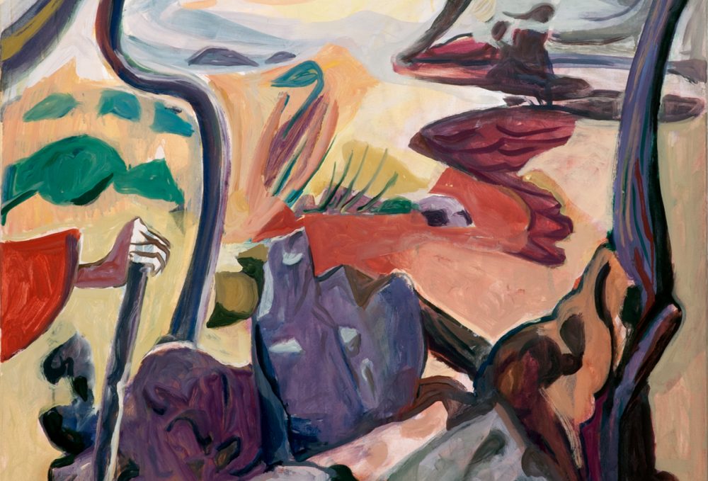
Jackie Gendel, Comedy of Manners, 2012, oil on canvas over panel, 34″ x 44″I liked the paintings and found myself continuing to think about them, perhaps because of, rather than in spite of, their opacity. There is something really wonderful about Gendel’s ambition, as if the artist wanted to have it all — abstraction, representation, narrative, concept, process, and emotional and intellectual content, straddling both contemporary and traditional values. There is also real pleasure in her bravura handling of juicy paint and rich and strange color chords, the finesse of her slashing line drawing, and the audacity of drawing on such a range of unfashionable or difficult to integrate source material.

I had planned on making more trips to see the show again, when Sandy struck and the gallery was among those badly flooded, closing down for nearly three months. (Gendel’s paintings, above the high water mark, were not damaged.) I was very happy then, for the artist, for the gallery and, selfishly, for myself, when I heard that the gallery was reopening, and with this show.

This version includes all new work save four returns, all now hung in the once flooded basement, placing them, metaphorically, underwater. Upstairs, several of the canvases are include stenciled waves. Gendel has used a garden pesticide sprayer with oil paint (with torn paper as stencils), the wave imagery dominating the previous incarnations of each painting, invoking a clear reference to the Sandy-flood and the following recovery. Gendel thereby deftly achieves two things; one the viewer is allowed into the previously solipsistic narrative and two, the pictorial chaos has been effectively organized. On top of this, the stenciled areas have the casual look of sponge painting, a device more likely to be found in a homemade children’s room mural or a low-end neighborhood restaurant, bringing a lightness to the otherwise anxious proceedings.

2013-02-01-11_gendelcarriedwomanii1372x60.jpgJackie Gendel, Carried Woman II, 2013, oil on canvas, 72 x 60″The most successful piece here is unique among her works that I’ve encountered: a large canvas, more crammed with heads than usual and painted in a range of styles, have been over painted with sharp edged geometrically structured white shapes. The effect is multi fold; on one hand the chaotic goings on are organized by the grid, much as the wave motif had in the other paintings. At the same time the white reads very much like a wall, visually dissolving into the white walls of the gallery, so that the painting underneath reads as a grouping of small paintings installed on a wall. However, because the white is painted on top, and with such definitiveness, it becomes a cancellation of the underneath imagery. So, the physical positive reads as negative space, while simultaneously fracturing and unifying the underneath imagery.

2013-02-01-11_gendelpartyline1364x51125.jpgJackie Gendel, Party Line, 2013, oil on canvas, 64 x 51″This cancellation is, I believe, a core value of Gendel’s work. One of the clearest pieces in the November show was a small water based drawing in which the upper left diagonal half of the painting, an image of two figure reminiscent of Fuseli, was painted out with a not quite entirely opaque gray triangle thereby integrating and relating the drama of the pictorial fiction with the evolving painterly process.

2013-01-31-27_gendeljudithii1112375x108125.jpgJackie Gendel, Judith II,2011, Watercolor, gouache and ink on paper, 12 3/8 x 10 13/16″The press release states that in this version of the show, Gendel intended to “register the emotional high water mark of the artwork rescue effort and the conviviality that the art community fostered after the storm.” On top of that, I would argue that the shared story and experience has shifted Gendel’s paintings beyond the personal and inspired a formal leap forward in her work. Here’s to hoping that her continued evolution will take place under calmer conditions.

Jackie Gendel is open through Feb. 9th, 2013
Jeff Bailey Gallery
625 W27TH ST (11th & 12th Aves)
NY, NY 10001

HC Westermann


HCW1.BoyintheForest1953CaseinVeneeredPlyOf all the art that I saw at last weekend’s NYC art fairs, the most exciting display was the display of HC Westermann paintings, sculptures and works on paper at Lennon, Weinberg Gallery from the ADAA Art Fair. The gallery mounted a Westermann exhibit a couple of years ago, which I enjoyed and took some inspiration from. Though there was some overlap, this display was deeper, wider and richer. There were early paintings that have recently come out of private collections; Boy in the Forest, from 1953 taking cues from Paul Klee, sang clear, loud and beautiful.  This is an example of a great artist able to take an influence and make it his own. Battle of Little Big Horn, from 1959 and Chicago Joint, from 1954, on the other hand, make clear how much of an influence Westermann was on younger Chicago painters, in particular the Imagists especially Karl Wirsum and Jim Nutt. Chicago Joint has faint echoes of Stuart Davis but with a quirky madness and humor that I see as some of main characteristics of Westermann’s vision.

1.HCW-ChicagoJoint1954oilcanvas1.HCWestermannLittleBigHorn1959oilpanel

A Poorly Stretched Canvas –A Woodcarving, from 1965, has a beautifully carved black-stained floral-motifed frame around a carving of canvas with a hole punctured in it. In a twist, the wood grain of the canvas is painted. This is such a strange piece.

1.HCW-APoorlyStretchedCanvas-AWoodcarving1965

Among the works on paper, my favorites were Holiday Inn, 1972, and Heart of Darkness- Joseph Conrad, 1977. Holiday Inn comes from Westermann’s period in LA (where he continued to influence the younger artists he met) and depicts a post-apocalyptic resort. Heart of Darkness parallels this vision of entropic human efforts at civilization and control.

1.HCWestermanHolidayInn1972ink-wc

Westermann served in the Marines in WW II and the Korean War and it’s clear that his experiences there informed both his imagery and his acerbic wit.

1.HCWestermanHeartofDarkness77

As I continued making the art fairs I found that I was not the only one was excited about this work. Several other  dealers identified this as a high point for them as well. I have to admit too, that I’ve been slow come around to Westermann. I missed the retrospective that Michael Rooks mounted at the MCA in Chicago a few years back. Isolated pieces seemed interesting, but not mineable (like most artists I’m a part-time image and idea thief- don’t tell). The take away here for me though, is an example of an artist who can draw on the things he sees in the world and from his experience and express them in his own idiom; strange, idiosyncratic, humorous, personal ultimately, curious. That is a practice to emulate.